
Opening Titles: Part 1
Exploring the cinematic tradition of opening sequences — their history, where they went and why we need them back.
It’s only right to open this blog with an opening title sequence of my own — and of course what I mean by my own is one I ripped off from The Muppets.
This clip from The Great Muppet Caper (1981) provides us with a general understanding of what we, the audience, have come to expect from opening title sequences. For your standard opening credits, we imagine no action, lots of names, and if we’re lucky maybe some flashy graphic design lasting about two minutes or so. We know that opening title sequences are, more often than not, inconsequential, as Kermit jests ‘Listen. Nothing is going to happen, this is just the opening credits’.
It’s true, we don’t expect any major plot points this early in the film. The opening credits give us some time to get comfortable, relax, unwind, maybe organise the rationing of cinema snacks between friends; they serve as a buffer period so we can leave the outside world behind and fully immerse ourselves in the world of the film. Which brings us right to Fozzy Bear’s punchline, ‘Nobody reads those names anyway, do they?’
But I’m Emily and I do read ‘those names’.
This is Opening Titles.
New Beginnings
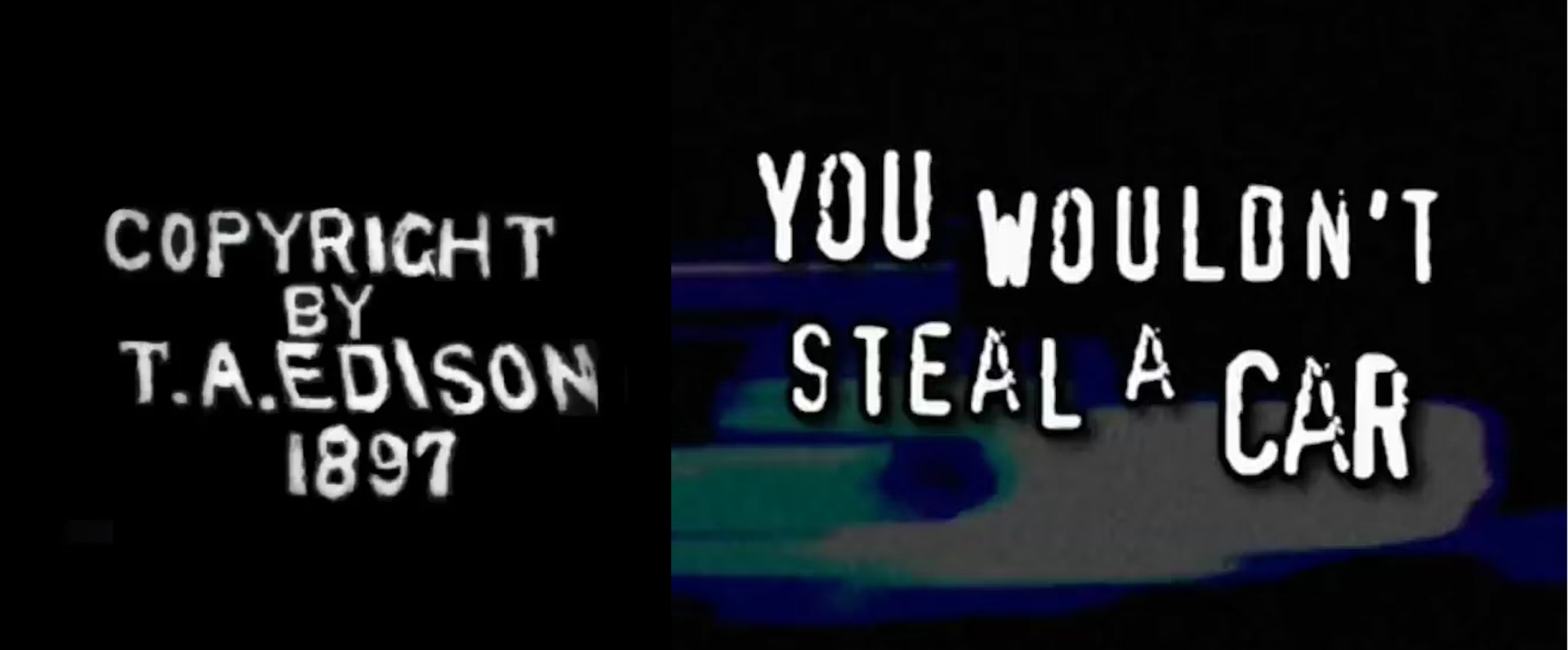
Our timeline begins with Thomas A. Edison in 1897 and the earliest conception of the opening title sequence: the copyright card. Edison used front cards to display copyright information at the start of his films such as Trapeze Disrobing Act (1901). This was done in an effort to combat film piracy, which is ironic as Edison was allegedly responsible for the piracy and exhibition of countless foreign films. Admittedly, I find it hard to imagine that piracy existed before the highly unsuccessful You wouldn’t steal a car campaign — the anti-piracy advertisement that used stolen music to convey its anti-theft message to the world.1
Following the controversial patent of the phonograph in 1877, Edison was taking no chances when it came to claiming his next work. The copyright card was a demonstration that the film belonged solely to the producer, not the cast, crew nor distributor. Without formal accreditation, film stars were known colloquially by their character names such as actress Mary Pickford known as ‘Little Mary’, or Florence Lawrence as ‘The Biograph Girl’. This did not last long as the pervasive ‘Star System’ from Broadway made its way into Hollywood — we know all too well that casting celebrity performers is a viable way of marketing your film. In 1908, G. M. ‘Broncho Billy’ Anderson became the first actor ever credited on screen in The Life of an American Cowboy; this marked a shift in both the format of title sequences and public interest into the personal lives of silent film stars — lives that were increasingly exposed and sensationalised in the press.
In the silent era, we see the introduction of intertitles, first attributed to Cecil Hepworth’s How It Feels to Be Run Over in 1901 and Scrooge (Marley’s Ghost) (1901) dir. by Walter R. Booth. As intertitles (made with printed board or painted glass) became commonplace tools to convey dialogue or exposition, we soon see genesis of the title card, popularised by The Great Train Train Robbery (1903) — which is largely considered as the first feature film. In Humorous Phases of Funny Faces (1906), we begin to see experimentation with the opening sequence design with J. Stuart Blackton using chalk and stop motion to create a dynamic title treatment; it is therefore evident that the opening sequence has an established potential for both pragmatic and creative functions.

To say that cinema-going at the beginning of the century was different to the modern day experience is an understatement. Early cinema screenings often included newsreels and cartoon shorts before the feature presentation, and the previews for the upcoming releases were shown after the main film. This is where we get the term trailers from — as the previews used to trail after the feature. However, when cinemas and studios realised audiences were not staying for the additional promotional material, they were brought to the beginning of the film, yet somehow the name trailers stuck around. This is the kind of fun fact that stops me from ever getting a second date.
The silent film era had overseen the standardisation of title cards and/or credit sequences: implementing static cards that vaguely emulated the aesthetic stylings of the feature. Yet still opening titles were perceived as an inessential part of the film; these sequences were projected whilst the lights were dimming and the curtains were rising. However in 1927, sound film or Talkies (not my blog talk show) paved the way for more experimental opening titles due to the introduction of the overture.
The overture is a musical instrumental piece that often inaugurates the score’s themes/motifs and this prelusive 2-5 minute sequence gave lettering designers an opportunity to craft different styles of credit sequences. Experimental title design originated in Europe where film existed as more of an artisanal product, not yet hindered by the mass manufacturing mentality of Hollywood. This can be seen in productions such as The Adventures of Prince Achmed (1926) or Hitchcock’s first feature The Lodger: A Story of The London Fog in 1927.
 — Art of the Title")
Studio Standards
Two years following the first sound film The Jazz Singer (1927), we get the first and last appearance of the ‘Best Title Writing’ award at the first ever Academy Awards in 1929. Title writing: out, and sound film: in. The death of silent film marked the dawn of the Golden Age of Hollywood and studio system hegemony. Say Hello to the Big 5 — Universal (I love you Universal Pictures, I would never criticise you), Paramount, Warner Bros., Disney, and Sony. Under the studio system, opening titles were often a separate part of the film’s manufacture. One department would be responsible for a studio’s entire catalogue of opening titles, which resulted in little variation between them. The sequences would follow the same routine structure: the studio card, the names of stars, the title, the heads of departments (optional), and lastly the director — this will be important later on.
 — Art of the Title")
The type of employment contracts under Hollywood studio system also contributed to standardising the title card format. Since directors and actors were considered employees of the studio and not of a singular film production, the amount of credits required (by law) to be shown on-screen were limited. For example, members of the art department for the The Wizard of Oz (1939) would not receive a credit for their work as they were employed by the MGM studio for all MGM productions, rather than as freelancers for The Wizard of Oz. Moreover, the influence of censorship guidelines (the Hays code, 1934-68) ensured that studio films were most often Westerns, comedies, musicals, cartoons or biopics, leading to further generic standardised typography.2
‘We find ourselves [...] dealing with corporations rather than with individuals.’
— Harry Cohn of Columbia Pictures
Post-Studio Age
The post-WWII economic boom saw a great demand for graphic design (or so the internet says) and the collapse of the Hollywood studio system in 1949 made room for the rise of America’s new favourite pop culture art medium: advertising.
In my opinion, opening titles were not able to truly evolve until the collapse of the Golden Age (1929-49) and the despotic network of the Big 5 (Once again, not you Universal Pictures, I love you). If you are not familiar with the Supreme Court case United States v. Paramount Pictures, Inc., long story short: the case concluded that production companies were no longer allowed exclusivity rights on which cinemas exhibited their films. Essentially if you were a production company and a distribution company, you now had to share your toys (cinema listing space) with independent and foreign film productions. The Supreme Court’s ruling on Paramount’s vertical integration within the film business put a swift end to the studio system’s movie monopoly. I wonder if we will see history repeat itself with certain studio franchises (not naming names) participating in block booking and other anti-competitive, monopolistic trade practices… You’ll all be glad to know that’s the end of ECav’s Movie Econ 101, but it is necessary context for what is to follow.
The dismantle of the studio system meant that directors and producers could be more artistically involved in all facets of the film’s production, including that magic word from earlier: advertising. I would suggest there is no more noble a profession than movie marketing — totally not biased. For example, creative trailers become more popular — Hitchcock’s suspenseful trailer for Psycho (1960) which contains no footage from the actual film but rather Hitchcock giving a tour of the set.3 Freedom from studio conglomerates allowed designers to push the boundaries of what title sequences could do — artistically and technologically. Kinetic typography had been displaced now that opening titles could stylistically synthesise the conceptual essence of a film. Making the ordinary into the extraordinary, as film so often does.
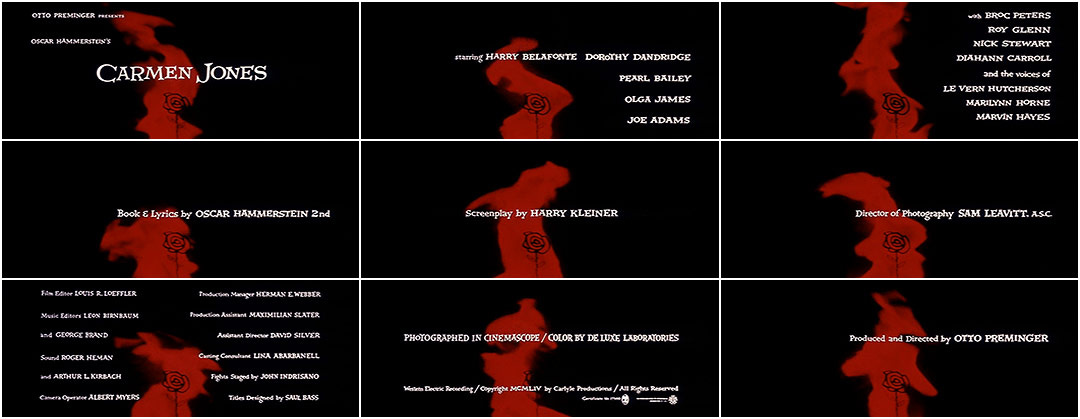
Designer Saul Bass, trained in New Bauhaus and mid-century Swiss styles, revolutionised the open title sequence. Bass’ first title sequence was in collaboration with Otto Preminger for Carmen Jones (1954); Bass condensed the themes of the original opera into one symbol: a flaming red rose. Their second collaboration for The Man With the Golden Arm (1955) was a breakthrough in title sequence design, refining its relationship to the feature. Both the director and designer wrote to cinemas across America demanding the curtain be raised during the opening credits, arguing that they form a significant component of the film’s narrative. Following his work on The Seven Year Itch (1955), Bass began his most recognisable works with a very recognisable director: Hitchcock’s Vertigo (1958), North by North West (1959) and Psycho (1960).

Psycho’s opening titles includes a series of fast moving horizontal and vertical lines; these grey, black and white lines serve as a visual metaphor for the themes later explored in the movie. Hitchcock (who actually started his career as a title designer) uses varying shades of light and dark to convey the split personality of our eponymous ‘psycho’, Norman Bates. These lines were created using 6 foot long aluminium bars painted black, shot by an overhead camera to capture the stop motion animation. Later in the opening sequence, the Psycho title treatment is split in half, decapitated in a single stab-like jolt, foreshadowing the killer action yet to come. Bass is able to establish tone, genre, themes and plot through the ostensibly simple visual metaphor of some lines moving on screen. And if you don’t take my word for it, here’s Martin Scorsese on Saul Bass: ‘His titles are not simply imaginative identification tags. When his work comes on the screen, the movie itself truly begins’ (Source unknown, so I guess he might not have said that).
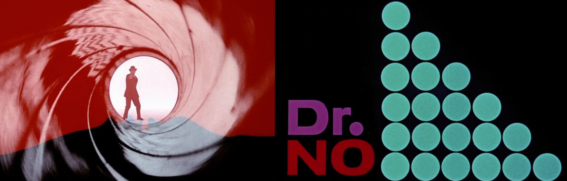
Saul Bass’ iconic designs were a huge influence on Maurice Binder’s opening title work for the James Bond franchise. In 007’s first film Dr No (1962), Binder created an opening sequence inspired by European Modernism and early Modern artists such as Matisse and Picasso. The gun barrel sequence was created using a pinhole camera inside of a 38 calibre gun barrel. Many film critics compare this opening shot to the final shot of a film I referenced earlier: The Great Train Robbery (1903), in which the film’s antagonist shoots his gun directly at the camera to startle the audience. Both shots do not necessarily serve a narrative function, but rather indulge in the thrills of the cinematic medium and film narratology. Exciting stuff!
Another prominent name in title design is Pablo Ferro, whose work on titles such as Dr. Strangelove (1964), The Thomas Crown Affair (1968), Stop Making Sense (1984) The Addams Family (1991), and Men In Black (1997) earned him induction to the Art Directors Club Hall of Fame Award in 2000. Ferro was a pioneer of rapid montage, quick cut editing, split-screen and the unconventional blending of art, still photography, film footage, sound and music. Ferro’s work too challenges the boundaries of the opening sequence medium. Yes, the title sequence is complementary to the feature, but evidently it can also serve as an art piece itself with its many fragmentations, layering, tensions and humours.
Naturalism in 1960s/70s
Despite the commercial and critical success of the early 60s modernist title sequences, the films of the late 1960s and 1970s often rejected the highly stylised openings, instead opting for a natural, minimalist approach. A great example of this is The Graduate (1967) directed by Mike Nichols. Our protagonist Benjamin walks listlessly through an airport, looking lost and entirely disinterested in his surroundings, accompanied by tune of the century ‘The Sound of Silence’ by Simon and Garfunkel. There is a large blank space ahead of Benjamin (played by Dustin Hoffman); this space of course allows room for the opening credits, but more significantly, it visually communicates the distance between Ben and the world around him. Life, just like the credits, is passing Ben by and yet he demonstrates no attempt to change such a reality. I think Edgar Wright parodies this in the opening credits for Shaun of the Dead (2004); Shaun, thoroughly bored by his mundane life, passes by a series of credits and later, zombies.
 — Art of the Title")

In the 1970s, industrial change once again triggers a massive shift in the opening title form. Due to the rise of craft guilds in a newly freelance industry, unions were negotiating on-screen credits for the entire cast and crew. Consequently, the bulk of the credits had to find a new home and in most cases, were moved to the end of the film, which made opening credits shorter and decline in popularity. Though the end credit sequence was not necessarily exclusive to this era of American filmmaking, as my favourite film of all time West Side Story (1961) contains both a long beginning overture sequence and a stylised end credits montage — designed by the one and only Saul Bass. In the film, the names of cast, crew and creatives are scrawled in graffiti on a dishevelled urban surface; it is a cold, contemporary reimagining of what would be the original stage musical’s bows. The tragedy of both the narrative and the environment is authenticated by the camera’s patient zooms, scrutinising each hand-written credit on the wall and leaving the audience to reflect on the musicals’ themes of hate and conflict. It’s the best film ever — if you disagree, you can literally argue with the wall.
 — Art of the Title")
The new system under which unions negotiated fair accreditation for their members affected credit sequences, as new legal requirements could interfere with a director’s vision. Star Wars: Episode V – The Empire Strikes Back (1980) was the second Star Wars instalment from the brilliant mind of George Lucas, or so we think… A legal battle occurred prior to the theatrical distribution of The Empire Strikes Back due to a union violation in the opening credit sequence. To this day, the Writers Guild of America (WGA) and the Directors Guild of America (DGA) stipulate that if any credit is given in the film’s opening (including studio cards), the director must also be credited. George Lucas wanted to open The Empire Strikes Back with a Lucasfilm production card and then begin the illustrious Star Wars opening crawl. This was all well and good for A New Hope (1977), but George Lucas did not direct The Empire Strikes Back… Irvin Kershner did. The guilds collectively fined Lucas $250,000, so Lucas left the WGA, DGA and Motion Picture Association. In a sense, the unions caused a return to form for opening sequences, undermining directorial choices to ensure the legal formalities are being adhered to.

Following suit from the many iterations of opening titles, the popular end-credit format had to undergo its own artistic reinvention. This took many forms: Jackie Chan films such as Who Am I (1998) used the end credits to display stunt out-takes, Being There (1979) has a blooper reel playing during the credits, or see my personal favourite below:

Before we had a million Marvel multiverses each matched with their own self-aggrandising post-credit scene, we had real cinema with real end credit sequences. In the 1979 cinematic spectacle: The Muppet Movie, Animal addresses the audience directly urging them to ‘Go home!’. Or you have the ubiquitous line ‘James Bond will return in THE SPY WHO LOVED ME’. Another example of a classic post-credit moment is in Airplane! (1980) where there is a final call-back to the man waiting in a taxicab. Or famously in Ferris Bueller’s Day Off (1986) where the fourth wall is broken in true Ferris fashion one last time: ‘It’s over, go home’. Are these metafictional moments showing us that credit sequences have the capacity for subversion? Or is the self-referentiality an attempt to mask an outdated, boring, but legally-mandated practice? Will opening credit sequences be forever bound by their industrial contexts? Do credit sequences need to serve an artistic purpose if they are mostly at the end of the film?
Emily will return in Opening Credits: Part 2.
Join me next time for part two of my credit sequence retrospective, including but not limited to: David Fincher, television themes, streaming, second screens and my personal favourite title sequences.
Your friend always,
Emily
Anti-pirating ad music stolen › Dr Karl's Great Moments In Science (ABC Science) www.abc.net.au/science/articles/2013/01/29/3678851.htm
BFI Screenonline: The Hays Code, www.screenonline.org.uk/film/id/592022/
The Greatest Film Trailer of All Time? Psycho (1960), www.thefilmagazine.com/greatest-film-trailer-hitchcock-psycho/#:~:text=The%20first%20shock%20for%20the,the%20scene%20of%20the%20crime%27.